CORTEVA LOOKS AND FEELS LIKE A DIFFERENT KIND OF AG COMPANY, because it is. The design, imagery, messaging is all very clean and focused on humanity. Corteva Agriscience isn’t a brand that was born overnight. It was built one choice – a color, a photo, a headline – at a time. These choices define the brand in voice and design, and they’re also key for consistency. We built a global library of assets focused on creating awareness, communicating what we stand for and building trust with our stakeholders.
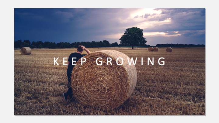
Tag Line | Keep Growing
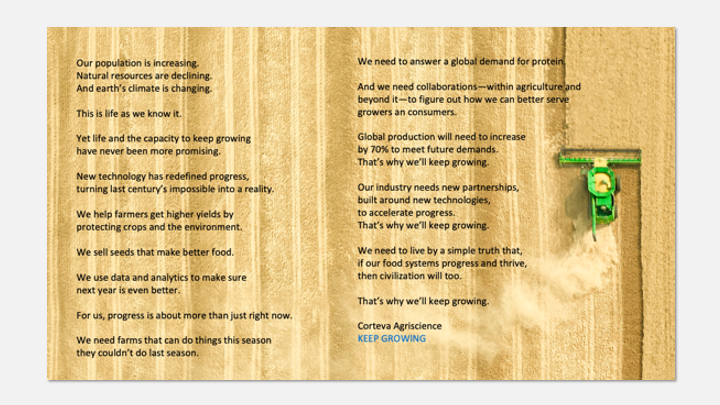
Creative Expression | Keep Growing Manifesto Narrative
Video | Brand Anthem | CGI in 14 Languages

Bespoke Global Image Library | Customers | Crops

Global Image Library | Decorated Photographer Joey L.

Employee Posters | Name
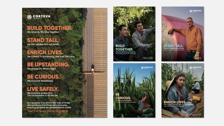
Employee Posters | Brand Values
Video | Executive Leaders | Brand Values Launch

Brand Logo Development

Creative Design Development

Advertisement

Advertisement

Advertisement
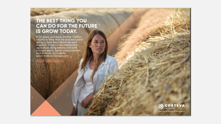
Advertisement
Video | Coming Back | Television Commercial

Suite of Creative Assets Rolled Out Globally

Social Media | Brand Execution
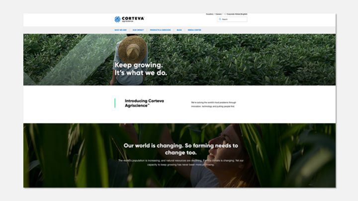
Website | Brand Design & Launch

Brand Editorial Content

Employee Engagement Program | Keep Growing Live

Tradeshow Design


